Co-op in the logo
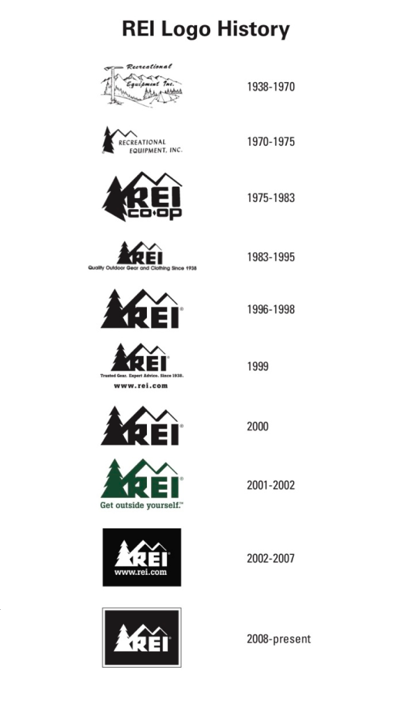
At the REI Co-op a funny thing happened sometime back in the 80s. It seemed to become afraid of being a co-op. At least that’s how it looked from the outside, because the formerly co-op heavy logo was now completely missing that that word. As part of a brand refresh, I made this a central issue. It was my opinion that this would be a powerful signifier for an organization in a state of change. We wouldn’t need to remind ourselves ‘oh yeah, we’re a co-op’ if it was right on front of everything we did. Then we could just focus on living up to that promise.
The process became a partnership with like-minded leadership and an external agency, resulting in a logo that is an only slightly cleaned up version of the Co-op former self, which preserved the past while allowing us to move into the future.
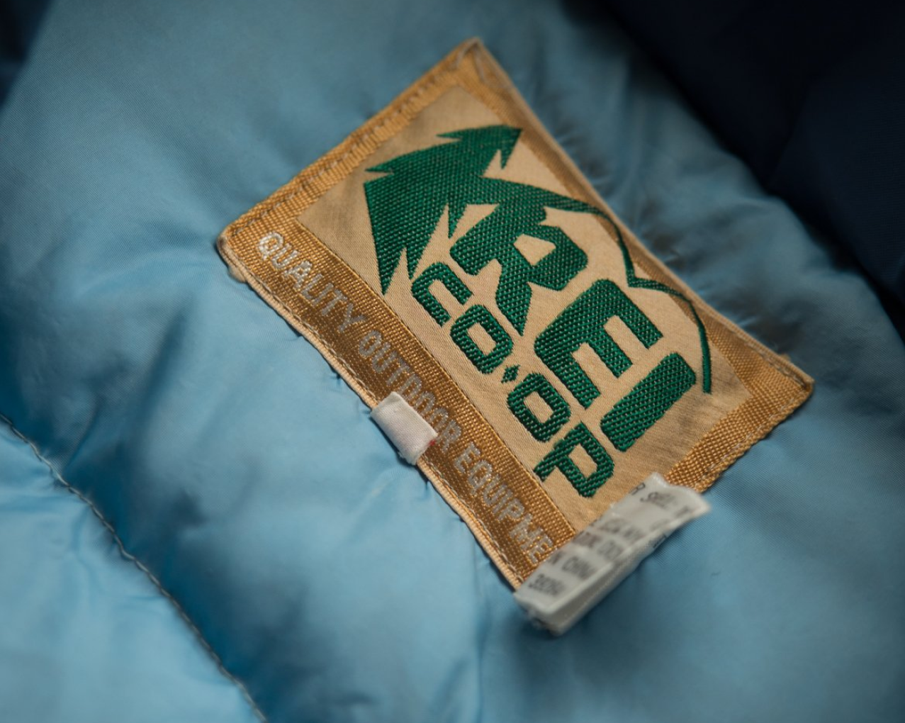
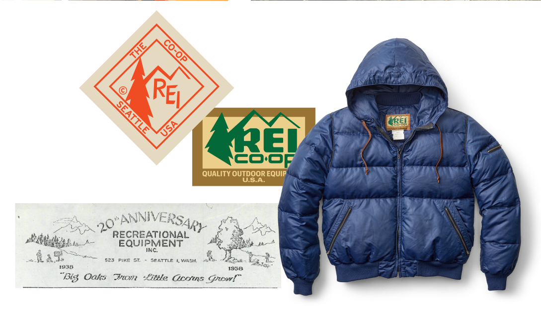
This might seem like a simple move, but it’s really hard to ask a company to behave like a co-op if that reminder isn’t front and center, daily. With this move, co-op was definitely back. Now there was a continuity in what the co-op stood for, and this showed up as a beautiful through-line in everything from our stores to the things we make.